CSS Utilities
Ionic Framework provides a set of CSS utility classes that can be used on any element in order to modify the text, element placement or adjust the padding and margin.
If your app was not started using an available Ionic Framework starter, the stylesheets listed in the optional section of the global stylesheets will need to be included in order for these styles to work.
Text Modification
Text Align
<ion-grid>
  <ion-row>
    <ion-col>
      <div class="ion-text-start">
        <h3>text-start</h3>
        Lorem ipsum dolor sit amet, consectetur adipiscing elit. Sed ac vehicula lorem.
      </div>
    </ion-col>
    <ion-col>
      <div class="ion-text-end">
        <h3>text-end</h3>
        Lorem ipsum dolor sit amet, consectetur adipiscing elit. Sed ac vehicula lorem.
      </div>
    </ion-col>
    <ion-col>
      <div class="ion-text-center">
        <h3>text-center</h3>
        Lorem ipsum dolor sit amet, consectetur adipiscing elit. Sed ac vehicula lorem.
      </div>
    </ion-col>
  </ion-row>
  <ion-row>
    <ion-col>
      <div class="ion-text-justify">
        <h3>text-justify</h3>
        Lorem ipsum dolor sit amet, consectetur adipiscing elit. Sed ac vehicula lorem.
      </div>
    </ion-col>
    <ion-col>
      <div class="ion-text-wrap">
        <h3>text-wrap</h3>
        Lorem ipsum dolor sit amet, consectetur adipiscing elit. Sed ac vehicula lorem.
      </div>
    </ion-col>
    <ion-col>
      <div class="ion-text-nowrap">
        <h3>text-nowrap</h3>
        Lorem ipsum dolor sit amet, consectetur adipiscing elit.
      </div>
    </ion-col>
  </ion-row>
</ion-grid>
| Class | Style Rule | Description |
|---|---|---|
.ion-text-left | text-align: left | The inline contents are aligned to the left edge of the line box. |
.ion-text-right | text-align: right | The inline contents are aligned to the right edge of the line box. |
.ion-text-start | text-align: start | The same as text-left if direction is left-to-right and text-right if direction is right-to-left. |
.ion-text-end | text-align: end | The same as text-right if direction is left-to-right and text-left if direction is right-to-left. |
.ion-text-center | text-align: center | The inline contents are centered within the line box. |
.ion-text-justify | text-align: justify | The inline contents are justified. Text should be spaced to line up its left and right edges to the left and right edges of the line box, except for the last line. |
.ion-text-wrap | white-space: normal | Sequences of whitespace are collapsed. Newline characters in the source are handled as other whitespace. Breaks lines as necessary to fill line boxes. |
.ion-text-nowrap | white-space: nowrap | Collapses whitespace as for normal, but suppresses line breaks (text wrapping) within text. |
Text Transform
<ion-grid>
  <ion-row>
    <ion-col>
      <div class="ion-text-uppercase">
        <h3>text-uppercase</h3>
        Lorem ipsum dolor sit amet, consectetur adipiscing elit. Sed ac vehicula lorem.
      </div>
    </ion-col>
    <ion-col>
      <div class="ion-text-lowercase">
        <h3>text-lowercase</h3>
        Lorem ipsum dolor sit amet, consectetur adipiscing elit. Sed ac vehicula lorem.
      </div>
    </ion-col>
    <ion-col>
      <div class="ion-text-capitalize">
        <h3>text-capitalize</h3>
        Lorem ipsum dolor sit amet, consectetur adipiscing elit. Sed ac vehicula lorem.
      </div>
    </ion-col>
  </ion-row>
</ion-grid>
| Class | Style Rule | Description |
|---|---|---|
.ion-text-uppercase | text-transform: uppercase | Forces all characters to be converted to uppercase. |
.ion-text-lowercase | text-transform: lowercase | Forces all characters to be converted to lowercase. |
.ion-text-capitalize | text-transform: capitalize | Forces the first letter of each word to be converted to uppercase. |
Responsive Text Classes
All of the text classes listed above have additional classes to modify the text based on the screen size. Instead of text- in each class, use text-{breakpoint}- to only use the class on specific screen sizes, where {breakpoint} is one of the breakpoint names listed in Ionic Breakpoints.
The table below shows the default behavior, where {modifier} is any of the following: left, right, start, end, center, justify, wrap, nowrap, uppercase, lowercase, or capitalize, as they are described above.
| Class | Description |
|---|---|
.ion-text-{modifier} | Applies the modifier to the element on all screen sizes. |
.ion-text-sm-{modifier} | Applies the modifier to the element when min-width: 576px. |
.ion-text-md-{modifier} | Applies the modifier to the element when min-width: 768px. |
.ion-text-lg-{modifier} | Applies the modifier to the element when min-width: 992px. |
.ion-text-xl-{modifier} | Applies the modifier to the element when min-width: 1200px. |
Element Placement
Float
The float CSS property specifies that an element should be placed along the left or right side of its container, where text and inline elements will wrap around it. This way, the element is taken from the normal flow of the web page, though still remaining a part of the flow, contrary to absolute positioning.
<ion-grid>
  <ion-row>
    <ion-col>
      <h3>no float</h3>
      <img
        alt="Silhouette of a person's head"
        src="https://ionicframework.com/docs/img/demos/avatar.svg"
        height="50px"
      />
      Lorem ipsum dolor sit amet, consectetur adipiscing elit. Sed ac vehicula lorem.
    </ion-col>
    <ion-col>
      <h3>float-left</h3>
      <img
        alt="Silhouette of a person's head"
        src="https://ionicframework.com/docs/img/demos/avatar.svg"
        height="50px"
        class="ion-float-left"
      />
      Lorem ipsum dolor sit amet, consectetur adipiscing elit. Sed ac vehicula lorem.
    </ion-col>
    <ion-col>
      <h3>float-right</h3>
      <img
        alt="Silhouette of a person's head"
        src="https://ionicframework.com/docs/img/demos/avatar.svg"
        height="50px"
        class="ion-float-right"
      />
      Lorem ipsum dolor sit amet, consectetur adipiscing elit. Sed ac vehicula lorem.
    </ion-col>
  </ion-row>
</ion-grid>
| Class | Style Rule | Description |
|---|---|---|
.ion-float-left | float: left | The element will float on the left side of its containing block. |
.ion-float-right | float: right | The element will float on the right side of its containing block. |
.ion-float-start | float: left / float: right | The same as float-left if direction is left-to-right and float-right if direction is right-to-left. |
.ion-float-end | float: left / float: right | The same as float-right if direction is left-to-right and float-left if direction is right-to-left. |
Responsive Float Classes
All of the float classes listed above have additional classes to modify the float based on the screen size. Instead of float- in each class, use float-{breakpoint}- to only use the class on specific screen sizes, where {breakpoint} is one of the breakpoint names listed in Ionic Breakpoints.
The table below shows the default behavior, where {modifier} is any of the following: left, right, start, or end, as they are described above.
| Class | Description |
|---|---|
.ion-float-{modifier} | Applies the modifier to the element on all screen sizes. |
.ion-float-sm-{modifier} | Applies the modifier to the element when min-width: 576px. |
.ion-float-md-{modifier} | Applies the modifier to the element when min-width: 768px. |
.ion-float-lg-{modifier} | Applies the modifier to the element when min-width: 992px. |
.ion-float-xl-{modifier} | Applies the modifier to the element when min-width: 1200px. |
Element Display
Display
The display CSS property sets whether an element is treated as a block or inline box and the layout used for its children, such as flow layout, grid or flex. It can also be used to completely hide an element from the layout.
Ionic provides the following utility classes for display:
| Class | Style Rule | Description |
|---|---|---|
.ion-display-none | display: none | Turns off the display of an element so that it has no effect on layout (the document is rendered as though the element did not exist). |
.ion-display-inline | display: inline | The element behaves as an inline element that does not create line breaks before or after itself. |
.ion-display-inline-block | display: inline-block | The element behaves as a block element that flows with surrounding content as if it were a single inline box. |
.ion-display-block | display: block | The element behaves as a block element, creating line breaks both before and after itself when in the normal flow. |
.ion-display-flex | display: flex | The element behaves like a block element and lays out its content according to the flexbox model. |
.ion-display-inline-flex | display: inline-flex | The element behaves like an inline element and lays out its content according to the flexbox model. |
.ion-display-grid | display: grid | The element behaves like a block element and lays out its content according to the grid model. |
.ion-display-inline-grid | display: inline-grid | The element behaves like an inline element and lays out its content according to the grid model. |
.ion-display-table | display: table | The element behaves like an HTML <table> element. It defines a block-level box. |
.ion-display-table-cell | display: table-cell | The element behaves like an HTML <td> element. |
.ion-display-table-row | display: table-row | The element behaves like an HTML <tr> element. |
Responsive Display Classes
All of the display classes listed above have additional classes to modify the display based on the screen size. Instead of display- in each class, use display-{breakpoint}- to only use the class on specific screen sizes, where {breakpoint} is one of the breakpoint names listed in Ionic Breakpoints.
The table below shows the default behavior, where {modifier} is any of the following: none, inline, inline-block, block, flex, inline-flex, grid, inline-grid, table, table-cell, table-row, as they are described above.
| Class | Description |
|---|---|
.ion-display-{modifier} | Applies the modifier to the element on all screen sizes. |
.ion-display-sm-{modifier} | Applies the modifier to the element when min-width: 576px. |
.ion-display-md-{modifier} | Applies the modifier to the element when min-width: 768px. |
.ion-display-lg-{modifier} | Applies the modifier to the element when min-width: 992px. |
.ion-display-xl-{modifier} | Applies the modifier to the element when min-width: 1200px. |
Deprecated Classes
The following classes are deprecated and will be removed in the next major release. Use the recommended .ion-display-* classes instead.
| Class | Description |
|---|---|
.ion-hide | Applies display: none to the element on all screen sizes. Deprecated — Use the ion-display-none class instead. |
.ion-hide-sm-{dir} | Applies the modifier to the element when min-width: 576px (up) or max-width: 576px (down). Deprecated — Use the ion-display-sm-{modifier} classes instead. |
.ion-hide-md-{dir} | Applies the modifier to the element when min-width: 768px (up) or max-width: 768px (down). Deprecated — Use the ion-display-md-{modifier} classes instead. |
.ion-hide-lg-{dir} | Applies the modifier to the element when min-width: 992px (up) or max-width: 992px (down). Deprecated — Use the ion-display-lg-{modifier} classes instead. |
.ion-hide-xl-{dir} | Applies the modifier to the element when min-width: 1200px (up) or max-width: 1200px (down). Deprecated — Use the ion-display-xl-{modifier} classes instead. |
Content Space
Padding
The padding class sets the padding area of an element. The padding area is the space between the content of the element and its border.
The default amount of padding to be applied is 16px and is set by the --ion-padding variable. See the CSS Variables section for more information on how to change these values.
<ion-grid>
  <ion-row>
    <ion-col class="ion-padding">
      <div>padding</div>
    </ion-col>
    <ion-col class="ion-padding-top">
      <div>padding-top</div>
    </ion-col>
    <ion-col class="ion-padding-start">
      <div>padding-start</div>
    </ion-col>
    <ion-col class="ion-padding-end">
      <div>padding-end</div>
    </ion-col>
  </ion-row>
  <ion-row>
    <ion-col class="ion-padding-bottom">
      <div>padding-bottom</div>
    </ion-col>
    <ion-col class="ion-padding-vertical">
      <div>padding-vertical</div>
    </ion-col>
    <ion-col class="ion-padding-horizontal">
      <div>padding-horizontal</div>
    </ion-col>
    <ion-col class="ion-no-padding">
      <div>no-padding</div>
    </ion-col>
  </ion-row>
</ion-grid>
| Class | Style Rule | Description |
|---|---|---|
.ion-padding | padding: 16px | Applies padding to all sides. |
.ion-padding-top | padding-top: 16px | Applies padding to the top. |
.ion-padding-start | padding-start: 16px | Applies padding to the start. |
.ion-padding-end | padding-end: 16px | Applies padding to the end. |
.ion-padding-bottom | padding-bottom: 16px | Applies padding to the bottom. |
.ion-padding-vertical | padding: 16px 0 | Applies padding to the top and bottom. |
.ion-padding-horizontal | padding: 0 16px | Applies padding to the left and right. |
.ion-no-padding | padding: 0 | Applies no padding to all sides. |
Margin
The margin area extends the border area with an empty area used to separate the element from its neighbors.
The default amount of margin to be applied is 16px and is set by the --ion-margin variable. See the CSS Variables section for more information on how to change these values.
<ion-grid>
  <ion-row>
    <ion-col class="ion-margin">
      <div>margin</div>
    </ion-col>
    <ion-col class="ion-margin-top">
      <div>margin-top</div>
    </ion-col>
    <ion-col class="ion-margin-start">
      <div>margin-start</div>
    </ion-col>
    <ion-col class="ion-margin-end">
      <div>margin-end</div>
    </ion-col>
  </ion-row>
  <ion-row>
    <ion-col class="ion-margin-bottom">
      <div>margin-bottom</div>
    </ion-col>
    <ion-col class="ion-margin-vertical">
      <div>margin-vertical</div>
    </ion-col>
    <ion-col class="ion-margin-horizontal">
      <div>margin-horizontal</div>
    </ion-col>
    <ion-col class="ion-no-margin">
      <div>no-margin</div>
    </ion-col>
  </ion-row>
</ion-grid>
| Class | Style Rule | Description |
|---|---|---|
.ion-margin | margin: 16px | Applies margin to all sides. |
.ion-margin-top | margin-top: 16px | Applies margin to the top. |
.ion-margin-start | margin-start: 16px | Applies margin to the left. |
.ion-margin-end | margin-end: 16px | Applies margin to the right. |
.ion-margin-bottom | margin-bottom: 16px | Applies margin to the bottom. |
.ion-margin-vertical | margin: 16px 0 | Applies margin to the top and bottom. |
.ion-margin-horizontal | margin: 0 16px | Applies margin to the left and right. |
.ion-no-margin | margin: 0 | Applies no margin to all sides. |
Flex Container Properties
Flexbox properties are divided into two categories: container properties that control the layout of all flex items, and item properties that control individual flex items. See Flex Item Properties for item-level alignment.

Align Items
The align-items CSS property sets the align-self value on all direct children as a group. In flexbox, it controls the alignment of items on the cross axis. In grid layout, it controls the alignment of items on the block axis within their grid areas.
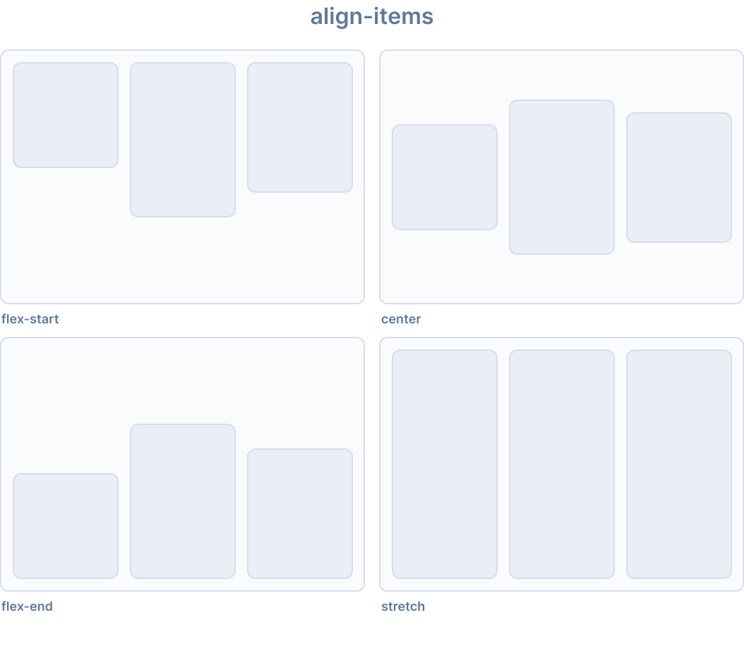
Ionic provides the following utility classes for align-items:
| Class | Style Rule | Description |
|---|---|---|
.ion-align-items-start | align-items: flex-start | Items are packed toward the start on the cross axis. |
.ion-align-items-end | align-items: flex-end | Items are packed toward the end on the cross axis. |
.ion-align-items-center | align-items: center | Items are centered along the cross axis. |
.ion-align-items-baseline | align-items: baseline | Items are aligned so that their baselines align. |
.ion-align-items-stretch | align-items: stretch | Items are stretched to fill the container. |
Align Content
The align-content CSS property sets the distribution of space between and around content items along a flexbox's cross axis, or a grid or block-level element's block axis.
This property has no effect on single line flex containers (i.e., ones with flex-wrap: nowrap).
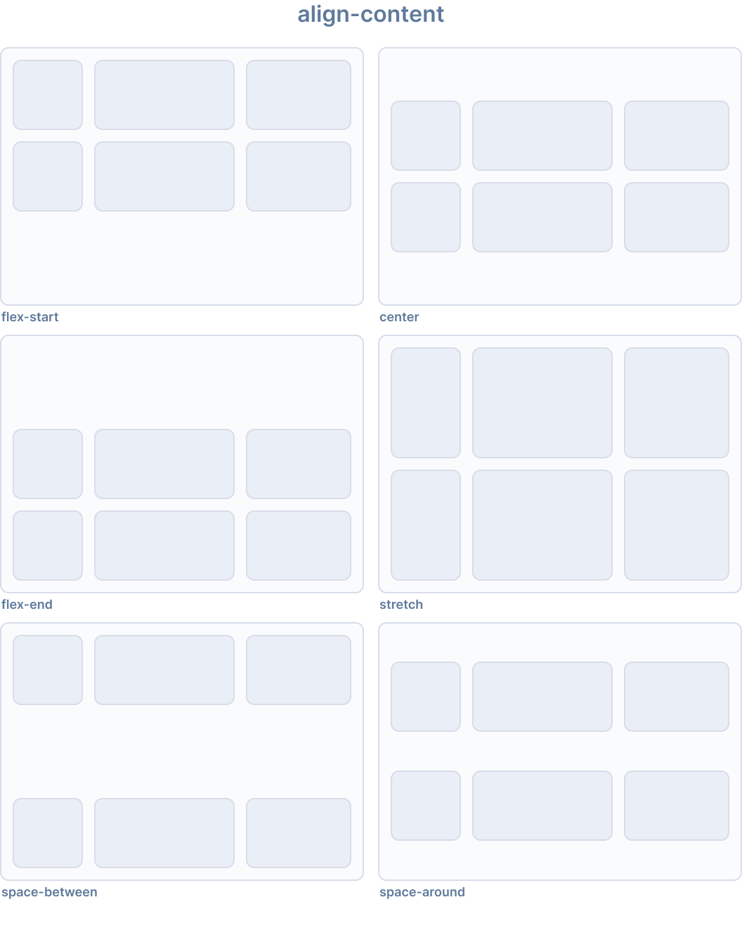
Ionic provides the following utility classes for align-content:
| Class | Style Rule | Description |
|---|---|---|
.ion-align-content-start | align-content: flex-start | Lines are packed toward the start of the cross axis. |
.ion-align-content-end | align-content: flex-end | Lines are packed toward the end of the cross axis. |
.ion-align-content-center | align-content: center | Lines are centered along the cross axis. |
.ion-align-content-stretch | align-content: stretch | Lines are stretched to fill the container. |
.ion-align-content-between | align-content: space-between | Lines are evenly distributed on the cross axis. |
.ion-align-content-around | align-content: space-around | Lines are evenly distributed with equal space around them. |
Justify Content
The justify-content CSS property defines how the browser distributes space between and around content items along the main axis of a flex container and the inline axis of grid and multi-column containers.
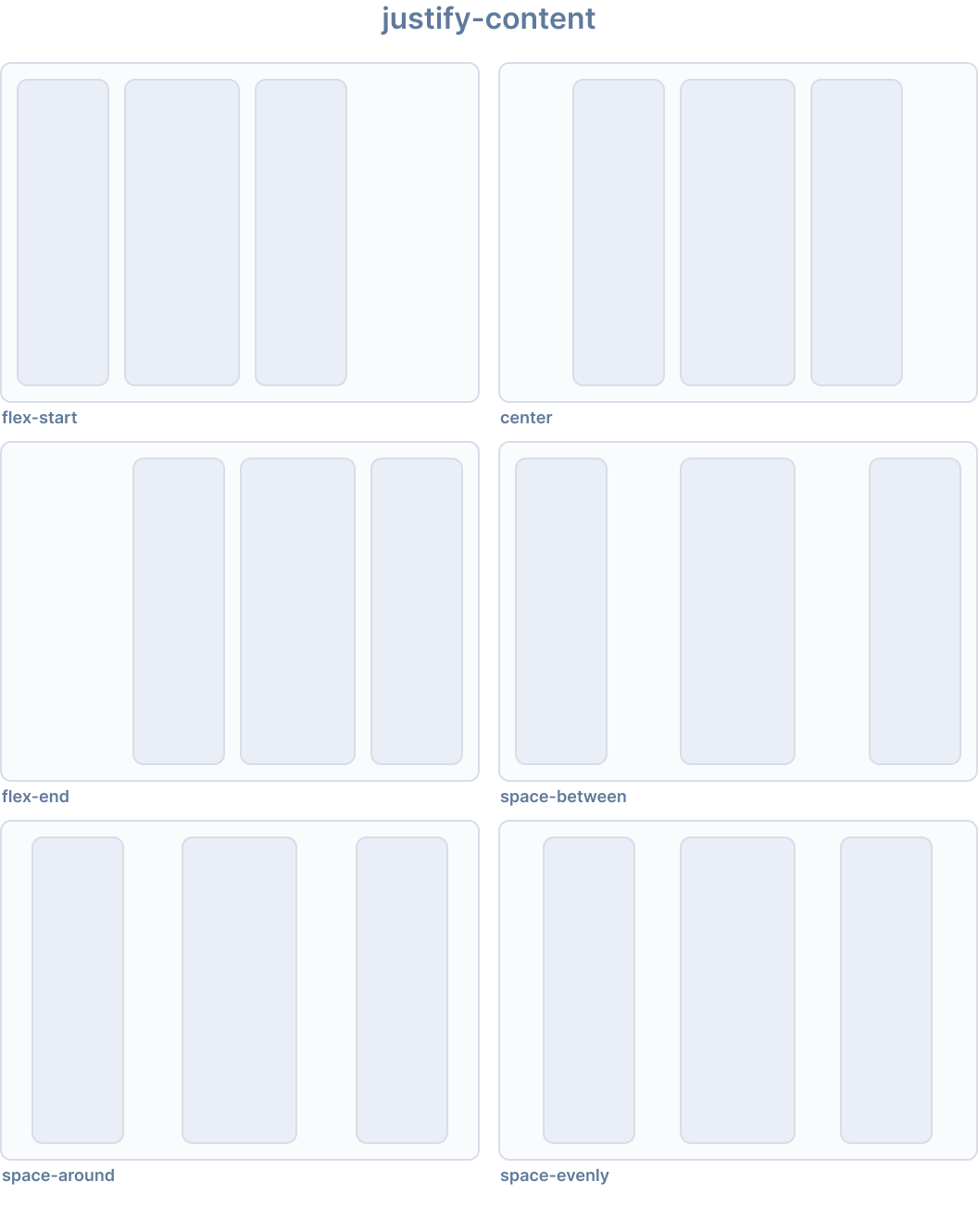
Ionic provides the following utility classes for justify-content:
| Class | Style Rule | Description |
|---|---|---|
.ion-justify-content-start | justify-content: flex-start | Items are packed toward the start on the main axis. |
.ion-justify-content-end | justify-content: flex-end | Items are packed toward the end on the main axis. |
.ion-justify-content-center | justify-content: center | Items are centered along the main axis. |
.ion-justify-content-around | justify-content: space-around | Items are evenly distributed on the main axis with equal space around them. |
.ion-justify-content-between | justify-content: space-between | Items are evenly distributed on the main axis. |
.ion-justify-content-evenly | justify-content: space-evenly | Items are distributed so that the spacing between any two items is equal. |
Flex Direction
The flex-direction CSS property sets how flex items are placed in the flex container defining the main axis and the direction (normal or reversed).
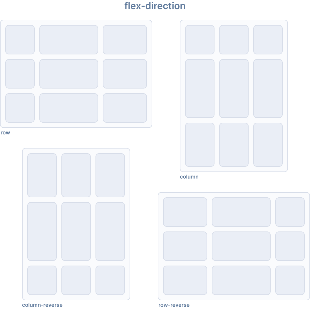
Ionic provides the following utility classes for flex-direction:
| Class | Style Rule | Description |
|---|---|---|
.ion-flex-row | flex-direction: row | Items are placed in the same direction as the text direction. |
.ion-flex-row-reverse | flex-direction: row-reverse | Items are placed in the opposite direction as the text direction. |
.ion-flex-column | flex-direction: column | Items are placed vertically. |
.ion-flex-column-reverse | flex-direction: column-reverse | Items are placed vertically in reverse order. |
Flex Wrap
The flex-wrap CSS property sets whether flex items are forced onto one line or can wrap onto multiple lines. If wrapping is allowed, it sets the direction that lines are stacked.
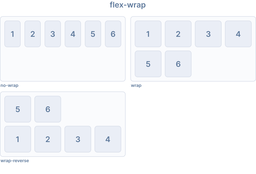
Ionic provides the following utility classes for flex-wrap:
| Class | Style Rule | Description |
|---|---|---|
.ion-flex-nowrap | flex-wrap: nowrap | Items will all be on one line. |
.ion-flex-wrap | flex-wrap: wrap | Items will wrap onto multiple lines, from top to bottom. |
.ion-flex-wrap-reverse | flex-wrap: wrap-reverse | Items will wrap onto multiple lines, from bottom to top. |
Responsive Flex Container Classes
All of the flex container classes listed above have additional classes to modify the properties based on the screen size. Instead of the base class name, use {property}-{breakpoint}-{modifier} to only use the class on specific screen sizes, where {breakpoint} is one of the breakpoint names listed in Ionic Breakpoints.
The table below shows the default behavior, where {property} is one of the following: justify-content, align-content, align-items, flex, or flex-wrap, and {modifier} is the corresponding value as described above.
| Class | Description |
|---|---|
.ion-{property}-{modifier} | Applies the modifier to the element on all screen sizes. |
.ion-{property}-sm-{modifier} | Applies the modifier to the element when min-width: 576px. |
.ion-{property}-md-{modifier} | Applies the modifier to the element when min-width: 768px. |
.ion-{property}-lg-{modifier} | Applies the modifier to the element when min-width: 992px. |
.ion-{property}-xl-{modifier} | Applies the modifier to the element when min-width: 1200px. |
Deprecated Classes
The following classes are deprecated and will be removed in the next major release. Use the recommended .ion-flex-* classes instead.
| Class | Description |
|---|---|
.ion-nowrap | Items will all be on one line. Deprecated — Use .ion-flex-nowrap instead. |
.ion-wrap | Items will wrap onto multiple lines, from top to bottom. Deprecated — Use .ion-flex-wrap instead. |
.ion-wrap-reverse | Items will wrap onto multiple lines, from bottom to top. Deprecated — Use .ion-flex-wrap-reverse instead. |
Flex Item Properties
Flex item properties control how individual flex items behave within their flex container. See also: Flex Container Properties for container-level alignment.
Align Self
The align-self CSS property overrides a grid or flex item's align-items value. In grid, it aligns the item inside the grid area. In flexbox, it aligns the item on the cross axis.
The property doesn't apply to block-level boxes, or to table cells. If a flexbox item's cross-axis margin is auto, then align-self is ignored.
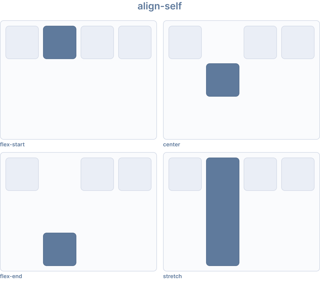
Ionic provides the following utility classes for align-self:
| Class | Style Rule | Description |
|---|---|---|
.ion-align-self-start | align-self: flex-start | Item is packed toward the start on the cross axis. |
.ion-align-self-end | align-self: flex-end | Item is packed toward the end on the cross axis. |
.ion-align-self-center | align-self: center | Item is centered along the cross axis. |
.ion-align-self-baseline | align-self: baseline | Item is aligned so that its baseline aligns with other item baselines. |
.ion-align-self-stretch | align-self: stretch | Item is stretched to fill the container. |
.ion-align-self-auto | align-self: auto | Item is positioned according to the parent's align-items value. |
Flex
The flex CSS property is a shorthand property for flex-grow, flex-shrink and flex-basis. It sets how a flex item will grow or shrink to fit the space available in its flex container.
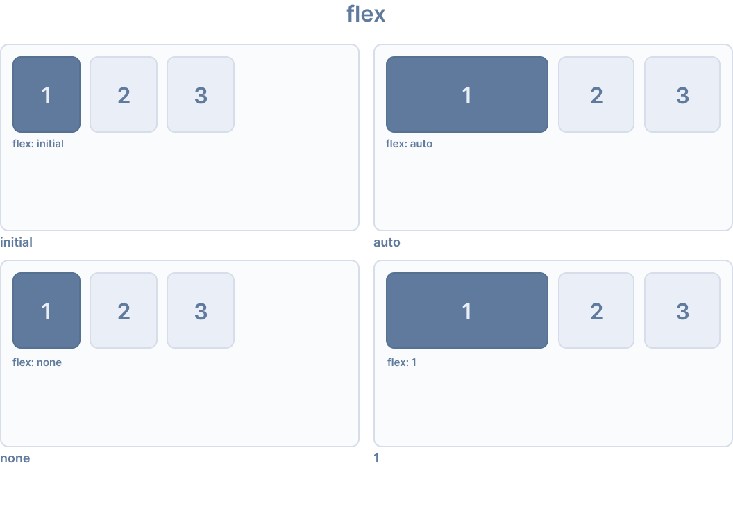
Ionic provides the following utility classes for flex:
| Class | Style Rule | Description |
|---|---|---|
.ion-flex-1 | flex: 1 | Item grows and shrinks equally with other flex items. |
.ion-flex-auto | flex: auto | Item grows and shrinks based on its content size. |
.ion-flex-initial | flex: initial | Item shrinks to its minimum content size but does not grow. |
.ion-flex-none | flex: none | Item does not grow or shrink. |
Flex Grow
The flex-grow CSS property sets the flex grow factor, which specifies how much of the flex container's positive free space, if any, should be assigned to the flex item's main size.
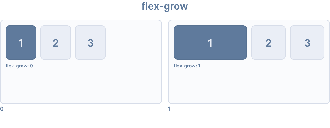
Ionic provides the following utility classes for flex-grow:
| Class | Style Rule | Description |
|---|---|---|
.ion-flex-grow-0 | flex-grow: 0 | Item does not grow beyond its content size. |
.ion-flex-grow-1 | flex-grow: 1 | Item grows to fill available space proportionally. |
Flex Shrink
The flex-shrink CSS property sets the flex shrink factor of a flex item. If the size of all flex items is larger than the flex container, the flex items can shrink to fit according to their flex-shrink value. Each flex line's negative free space is distributed between the line's flex items that have a flex-shrink value greater than 0.
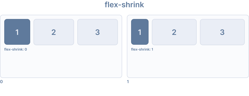
Ionic provides the following utility classes for flex-shrink:
| Class | Style Rule | Description |
|---|---|---|
.ion-flex-shrink-0 | flex-shrink: 0 | Item does not shrink below its content size. |
.ion-flex-shrink-1 | flex-shrink: 1 | Item shrinks proportionally when container is too small. |
Order
The order CSS property sets the order to lay out an item in a flex or grid container. Items in a container are sorted by ascending order value and then by their source code order. Items not given an explicit order value are assigned the default value of 0.
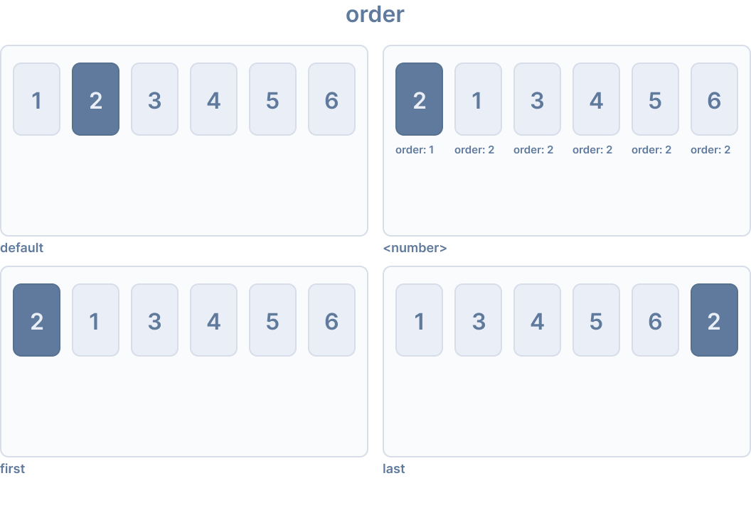
Ionic provides the following utility classes for order:
| Class | Style Rule | Description |
|---|---|---|
.ion-order-first | order: -1 | Item appears first in the flex container. |
.ion-order-0 | order: 0 | Item appears in its natural order. |
.ion-order-1 | order: 1 | Item appears after items with order 0. |
.ion-order-2 | order: 2 | Item appears after items with order 1. |
.ion-order-3 | order: 3 | Item appears after items with order 2. |
.ion-order-4 | order: 4 | Item appears after items with order 3. |
.ion-order-5 | order: 5 | Item appears after items with order 4. |
.ion-order-6 | order: 6 | Item appears after items with order 5. |
.ion-order-7 | order: 7 | Item appears after items with order 6. |
.ion-order-8 | order: 8 | Item appears after items with order 7. |
.ion-order-9 | order: 9 | Item appears after items with order 8. |
.ion-order-10 | order: 10 | Item appears after items with order 9. |
.ion-order-11 | order: 11 | Item appears after items with order 10. |
.ion-order-12 | order: 12 | Item appears after items with order 11. |
.ion-order-last | order: 13 | Item appears last in the flex container. |
Responsive Flex Item Classes
All of the flex item classes listed above have additional classes to modify the properties based on the screen size. Instead of the base class name, use {property}-{breakpoint}-{modifier} to only use the class on specific screen sizes, where {breakpoint} is one of the breakpoint names listed in Ionic Breakpoints.
The table below shows the default behavior, where {property} is one of the following: align-self, flex, flex-grow, flex-shrink, or order, and {modifier} is the corresponding value as described above.
| Class | Description |
|---|---|
.ion-{property}-{modifier} | Applies the modifier to the element on all screen sizes. |
.ion-{property}-sm-{modifier} | Applies the modifier to the element when min-width: 576px. |
.ion-{property}-md-{modifier} | Applies the modifier to the element when min-width: 768px. |
.ion-{property}-lg-{modifier} | Applies the modifier to the element when min-width: 992px. |
.ion-{property}-xl-{modifier} | Applies the modifier to the element when min-width: 1200px. |
Border Display
The .ion-no-border utility class can be used to remove borders from Ionic components. This class can be applied to the ion-header and ion-footer components.
<ion-header class="ion-no-border">
  <ion-toolbar>
    <ion-title>Header - No Border</ion-title>
  </ion-toolbar>
</ion-header>

<ion-footer class="ion-no-border">
  <ion-toolbar>
    <ion-title>Footer - No Border</ion-title>
  </ion-toolbar>
</ion-footer>
| Class | Description |
|---|---|
.ion-no-border | The element will have no border. |
Ionic Breakpoints
Ionic uses breakpoints in media queries in order to style an application differently based on the screen size. The following breakpoint names are used in the utility classes listed above, where the class will apply when the width is met.
| Breakpoint Name | Width |
|---|---|
xs | 0 |
sm | 576px |
md | 768px |
lg | 992px |
xl | 1200px |